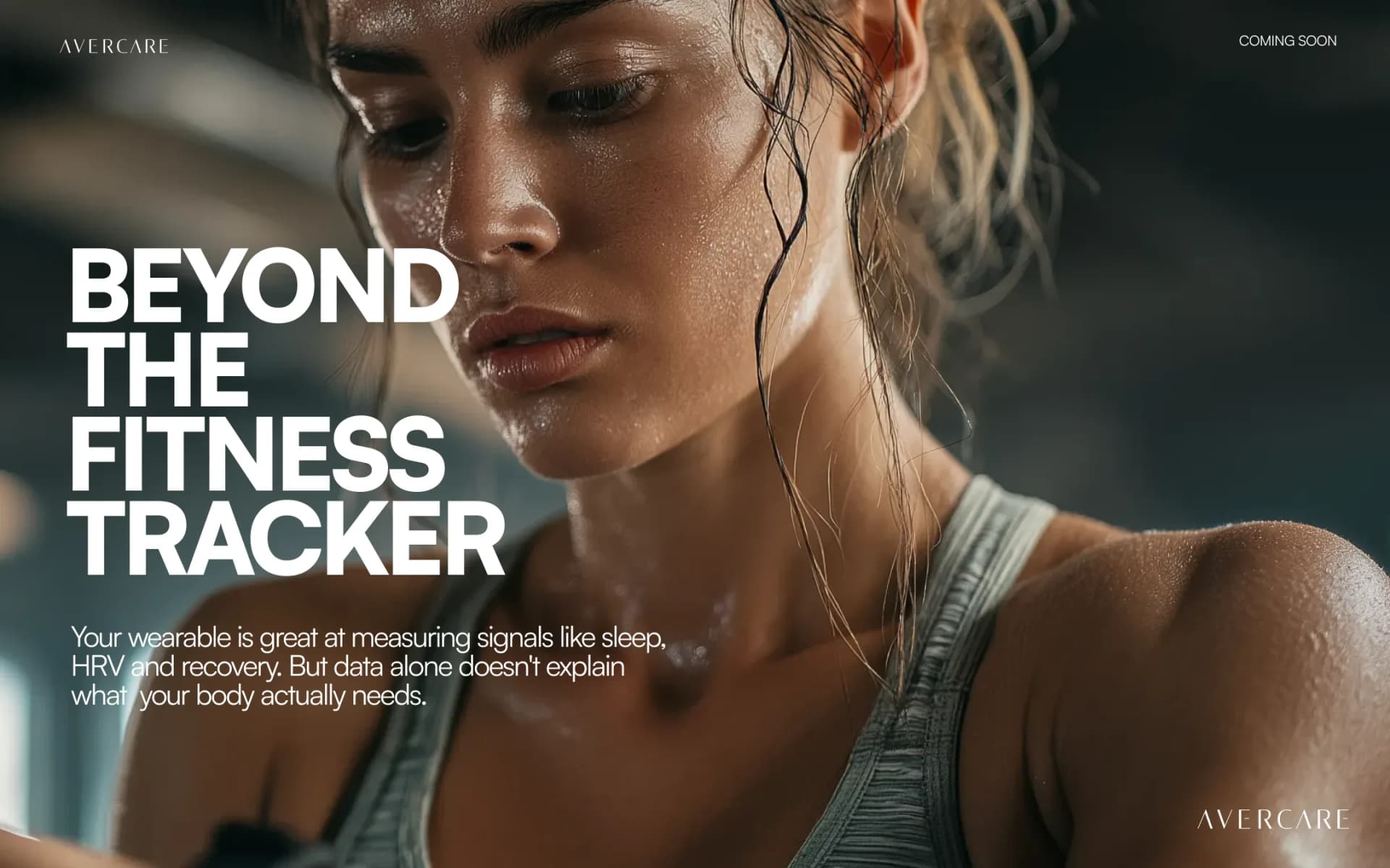
Your wearable counts everything, explains nothing
Your wearable is excellent at counting and poor at explaining. Here's the data-to-action gap, and why interpretation, not more metrics, is the missing layer.
A wall of numbers, no narrative
Glance at your wrist. Depending on the device, you can probably see your step count, your heart rate, the hours you slept, a recovery score, a readiness number, a stress reading, a measure of strain. It's a remarkable amount of information, gathered quietly and continuously, with no effort from you at all.
And yet there's a particular feeling that comes with looking at all of it. You feel informed without feeling understood. You know your recovery score is 62 this morning. You don't know why, whether it matters, or what to do differently because of it. The device has answered "how much" with real precision and answered "so what" with silence.
That isn't a failure of effort on your part, and it isn't a failure of the device's engineering. The wearable is doing exactly what it was built to do. What's missing is a layer that was never the device's job: interpretation. This is about that layer, why its absence quietly erodes trust in our own health data, and why the answer isn't more numbers.
Counting isn't understanding
Wearables deserve their due. They're genuinely impressive instruments, measuring more things, more accurately, with every passing year. But measurement and interpretation are different jobs. A thermometer reads a temperature with great accuracy. It doesn't explain a fever: it won't tell you what caused it, whether it's serious, or what you should do. We don't hold that against the thermometer. We understand that explaining isn't what a thermometer is for.
Wearables are extraordinary thermometers, and we've been quietly waiting for them to explain the fever. A score with no context is closer to trivia than to insight. It isn't a grade, it's a pattern, and a single number stripped of its pattern can't tell you much at all.
Take a concrete example. Your HRV reading drops 18% one morning. The device flags it as low and moves on. But that single number could mean any of a dozen things: a late dinner, a glass of wine the night before, the early hours of a cold, a hard training session 48 hours ago, an unusually stressful Tuesday, or simply ordinary biological noise. The number is identical in every case. The device can't tell you which story it belongs to, and without that story it can't tell you whether to rest, push, or ignore it entirely.
What that morning actually needs is health data interpretation. It needs the reading placed against your training load last week, your sleep debt over the last three nights, your stress pattern across the last month, and the fact that you flew yesterday. Only then does the number become a recommendation: skip the heavy session, prioritise sleep tonight, watch tomorrow's reading. That's the work the device was never built to do.
The data-to-action gap
This gap has a name in the research, and it runs in both directions. Wearables generate large volumes of data but typically don't tell users what to do with it, and clinicians frequently regard consumer wearable data as insufficiently reliable or actionable for clinical purposes (Source: Deloitte, "Why consumers and doctors are wary about wearable data", 2024).
Both halves matter equally. The user looks at the data and doesn't know what to do with it. The clinician looks at the same data and isn't sure how much to trust it. The number sits in the middle, generated faithfully, useful to neither party the way it should be. What's missing from both ends is the same thing: a layer that reads the signal in context, makes it legible to the person wearing the device, and makes it credible enough to mean something inside a clinical conversation.
Willingness is high; translation is low
Here's the encouraging part. People aren't indifferent to their health data. 95% of wearable users say they'd share their device-generated data with a medical professional, yet actual sharing behaviour lags well behind that stated willingness (Source: JMIR, Usage Trends and Data Sharing Practices of Healthcare Wearable Devices Among US Adults, 2025).
That contrast is the whole problem in a single statistic. The intent is overwhelmingly there. But the data, as it currently arrives — raw, uninterpreted, a stream of numbers without a narrative — isn't in a form that's easy to share or act on.
Picture it practically. Someone arrives at a brief appointment carrying a year of continuous heart-rate, sleep and activity data. There's no realistic way for a clinician to read months of raw signal in a short visit, and good reason for them to be cautious about consumer-grade wearable data they can't verify. So the data stays on the wrist. What would change that isn't a bigger export file. It's interpretation arriving first: the months of signal already read, summarised into a pattern and a plain-language account of what changed and when.
Why the drawer is full of trackers
There's a quieter, more familiar piece of evidence for the fitness tracker limitations we're describing, and it's probably in a drawer in your home right now.
Roughly one-third of wearable owners stopped using their device within six months, with about half abandoning it within a year (Source: Endeavour Partners, widely cited). Gartner has repeatedly placed wearable abandonment at roughly 29–30%. Different studies, different decades, the same direction of travel.
It's tempting to read those numbers as a willpower problem. That reading is unfair. A device that counts without explaining slowly stops feeling useful. The novelty of seeing the number wears off, and when it never resolves into meaning, there's little reason to keep checking. People don't give up on their health. They give up on data that never became understanding.
Those who do persist aren't a counter-argument. Among wearable owners, daily engagement is high — most who keep a device use it every day (Source: Rock Health Digital Health Consumer Adoption Survey, 2024). But engagement and understanding have come apart. A person can check a number faithfully every morning and still have no idea what to do with it. Habit isn't the same as insight. The drawer and the daily check are two halves of the same unmet need: a layer that turns the looking into knowing.
Adoption is uneven, too
There's one more limit to a device-first idea of health. Wearable adoption skews younger, higher-income, urban and privately insured, with persistently lower adoption among adults over 55, lower-income populations and rural communities (Source: Rock Health / JMIR, 2020–2022 survey data, published 2024).
If better health depends on owning the right gadget, then better health quietly becomes something distributed by income and postcode. A device-first model leaves people behind by design. An intelligence-first model — one that can interpret whatever signals a person already has, from whatever source — has a far better chance of meeting people where they actually are. The goal was never gadget ownership. It was understanding.
The interpretation layer, in practice
This is the gap AverCare is built to close. AverCare isn't another wearable. It isn't another dashboard. It isn't another score. It's the interpretation layer that sits above whatever signals you already have, reading them in context and turning them into a clear, reasoned next step.
What does wearable data interpretation actually look like? Your smartwatch reports that HRV is down this morning. AverCare reads that against last week's training load, your sleep debt over the last three nights, the stress pattern over the past month, and the fact that you flew yesterday. It tells you, in plain language, to skip the heavy session and protect sleep tonight — with a reason attached and a flag to revisit tomorrow.
Or this: a resting heart rate that's crept up by four beats per minute over six weeks. No single morning would catch it. AverCare reads it as a trend, sets it alongside the colder weather, a change in your evening routine, and a small drop in step count, and surfaces it as a direction worth watching — not a number to panic about.
Or this: a year of continuous health data summarised before a clinical appointment into one plain-language picture of what changed and when, in a form a clinician can actually use in a fifteen-minute conversation.
That's the work AverCare is built to do. It's an intelligent health platform that connects continuous signals, an AI companion called Aver, and clinically governed guidance into one calm layer between your data and your decisions. Aver does the explaining the device can't — answering "so what" rather than only reporting "how much". AverCare complements the devices and clinicians you already use; it doesn't replace them. (Direct syncing between the AverFit Band and the AverCare platform is currently in development.)
AverCare is pre-launch. If you've got a wrist full of numbers and a quiet wish that they meant more, you can be early to the layer that finally explains them. Join the waitlist, and follow along.
Know better.